Brand Identity Role: AD + GD Winner of Student Competition
About
Humber Polytechnic’s in-house, student-run creative agency was entering a new era and looking for a new visual identity. Below is the evolution of the winning concept for NEXT’s present branding.
Client
NEXT Student Agency
Collaborators
Maja Mahovac - Graphic Designer Parjad Minooei - Web Developer Kyle Peacock - Graphic Designer Ekaterina Smorodina - Graphic Designer
Origins
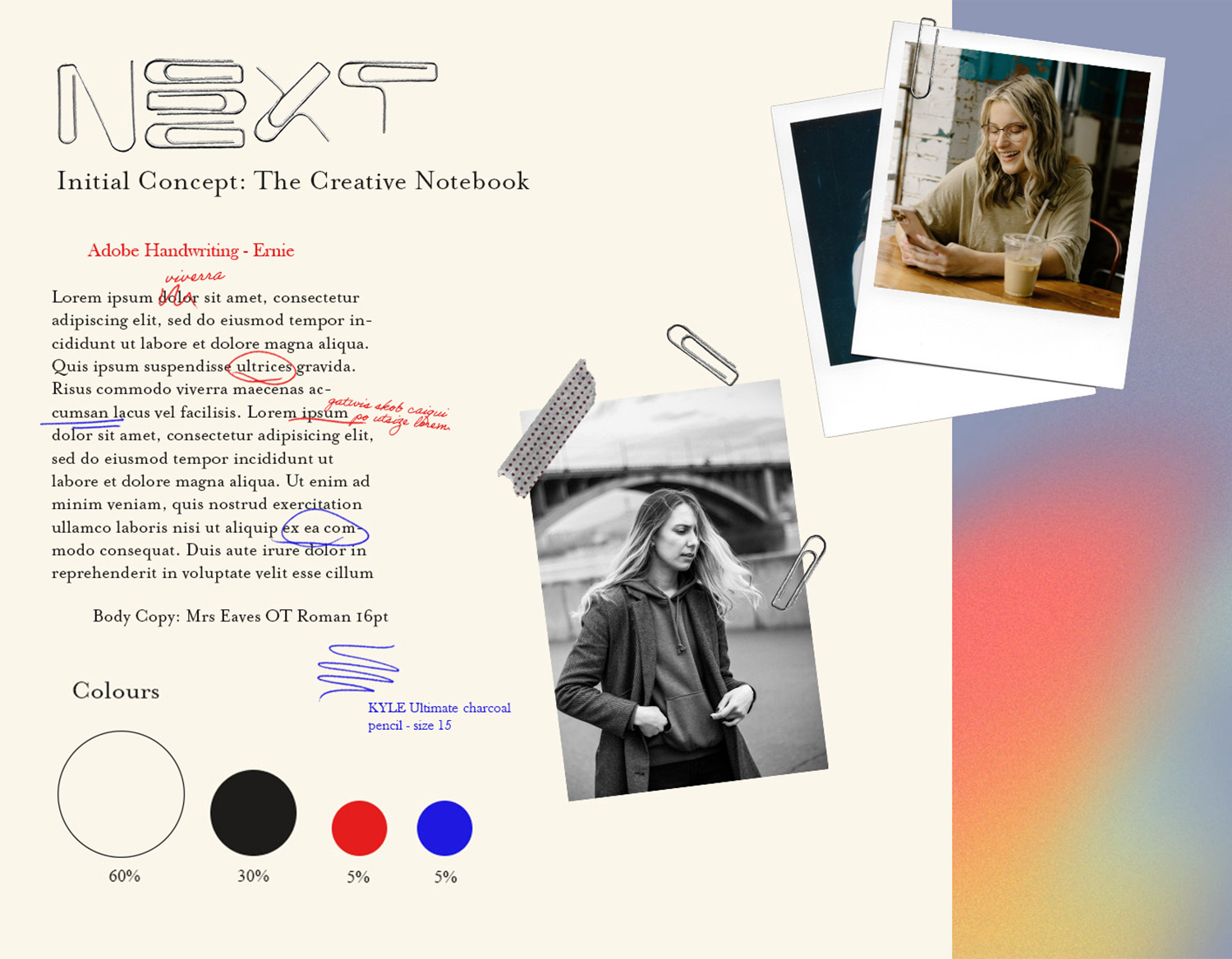
Slide 1: The initial pitched concept; born from playing with paperclips while thinking.
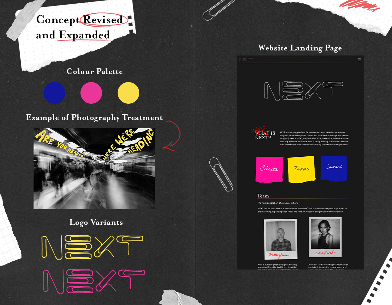
Slide 2: Revision of concept after client feedback.
Logo Evolution
Website Design
NEXT's website was created in collaboration with web developer parjad minooei
NEXT in Action
NEXT continues to provide amazing opportunities for humber students to grow and gain industry experience with real world clients, helping to secure internships for students, and creating networking opportunities with industry professionals.